Give me gif, Slack – case study
A UX/UI case study exploring how to improve Slack's cumbersome gif access. From research and problem analysis to designing an intuitive gif button solution that reduces search time from minutes to seconds.
The aim of this case study has focused on creating a contemporary design concept that would solve the issue of poor accessibility to gifs on Slack.
Emoji and animated messages have become a part of our writing culture. Sceptics might have thought that it is a step backwards in evolution (back to the time when people use hieroglyphs, perhaps?), but there are a lot of positives about this change. Using emoji can lighten the overall mood of the text, is understood across different languages and adds the ability to quickly express thoughts or emotions. According to Contactually, “your brain processes what it’s seeing on video 60,000 times faster than it processes text.” Sending a gif or a meme can also help improve communication between co-workers and is a great way to tighten the relationships.
“Emojis have become a cultural phenomenon, shaping the way we express ideas and emotions across languages, friends, and generations.” Dan Rhatigan
Overview
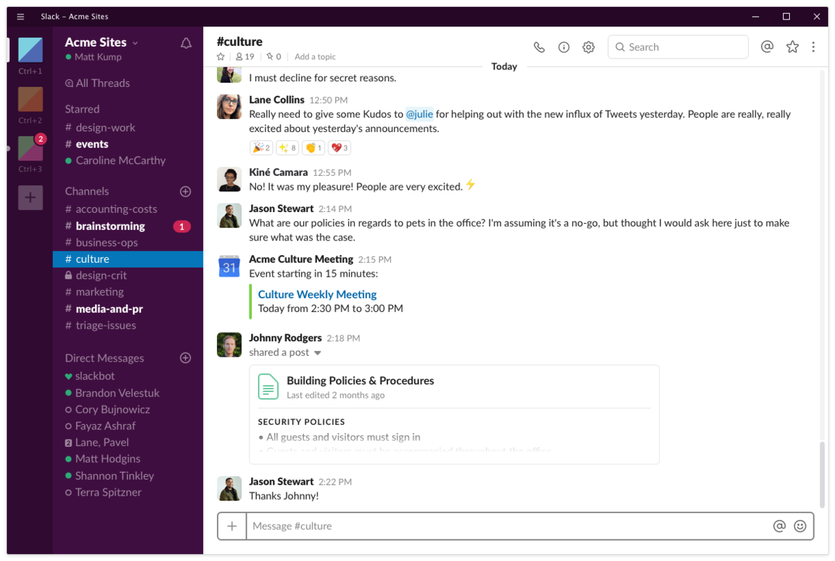
Let’s start by shining a bit of light on Slack itself. It is a channel-based messaging platform. Create a group or accept an invitation to an existing one, and then send messages, share files, call and connect other apps (e.g Github or DropBox). Mostly used in workplaces to communicate within a team. At the agency I work for, we have one general channel and one for every project we work on. This set up helps us work as a team, whether we are based in the office, working from home or from a different city. The current situation around the world and increased remote working make platforms like this even more important than ever, enabling communication with other members of the team.
 https://uk.pcmag.com/productivity-2/40141/slack
The challenge
As mentioned in the introduction, short, animated videos have become extremely popular and widely used to quickly express our thoughts and ideas. Instead of writing a long, wordy message that would perfectly describe our feelings, we can send a meme that does just that. Using gifs and memes on Slack is possible, but extremely time-consuming and not user-friendly at all. Let’s have a look at how to add a gif to a conversation on Slack at the moment:
- Click on the lightning icon
- Look for Giphy and click the link
- Type a word to look for meme
- SHUFFLE one gif at a time to find that perfect one
The issue that arises here is when you shuffle too much by mistake. You will have to spend some extra time shuffling and praying for a gif you wanted to reappear again. If you have a slow internet connection, it will elongate the search time too, as, after every shuffle, you have to wait for a gif to load. No straight-away access to gifs also creates an issue, when the user doesn’t know how to describe the gif he/she has in mind.
Estimated time to find your meme: WAY TO LONG.
Gifs on other platforms
Competitive Analysis
Facebook, WhatsApp or Twitter are only the few that have a messaging feature. All mentioned above have a gif button directly on the message tab, allowing users to quickly browse for a perfect animated message to add to the conversation. General styling and the number of extra features, like a search bar, favourite button, or grouping by a category varies throughout, but the ability to pain-free access to wanted content is present.
Estimated time to find what you are looking for: approx. 10-30 seconds.
Scope and constraints
The idea that would solve the issue of poor accessibility to gifs on Slack needs to seamlessly fit into the current design of the application. The key constrain is performance. The enhancement should not lower it. Slack is available for desktop and as a mobile app, therefore the concept needs to take into consideration both window sizes, with the focus on different users’ needs on each.
The solution
The analysis of the current design and how similar platforms are dealing with the issue have clarified, that the solution for observed time consuming and stressful access to gifs and memes should be an enhancement of the current system with a Gif button. So many applications are using this method for quick, easy access to gifs, and reusing that familiar design is, in my opinion, the way to go.
“In design, by making things that behave in a certain way appear as expected, we help our users make the most of their cognitive cache. In other words, we don’t make them think.” Jason Grigsby, Progressive web apps
Benefits of the Solution
The benefits of adding the gif button directly to the message window are enormous. Increased user experience will be visible on multiple spectrums:
- access to multiple gifs at the same time to allow comparison
- ability to browse different categories via the search bar
- shortened time spent on searching
- gifs visible without typing anything
- no issue with losing the perfect meme
Design enhancement process
Brainstorming Phase
The process of designing the enhancement mentioned above have started from the brainstorming phase. This step is crucial to explore possible options, get inspired, and quickly iterate through different ideas.
Deliverables from this phase are rough sketches of the concept:
 Desktop window sketches
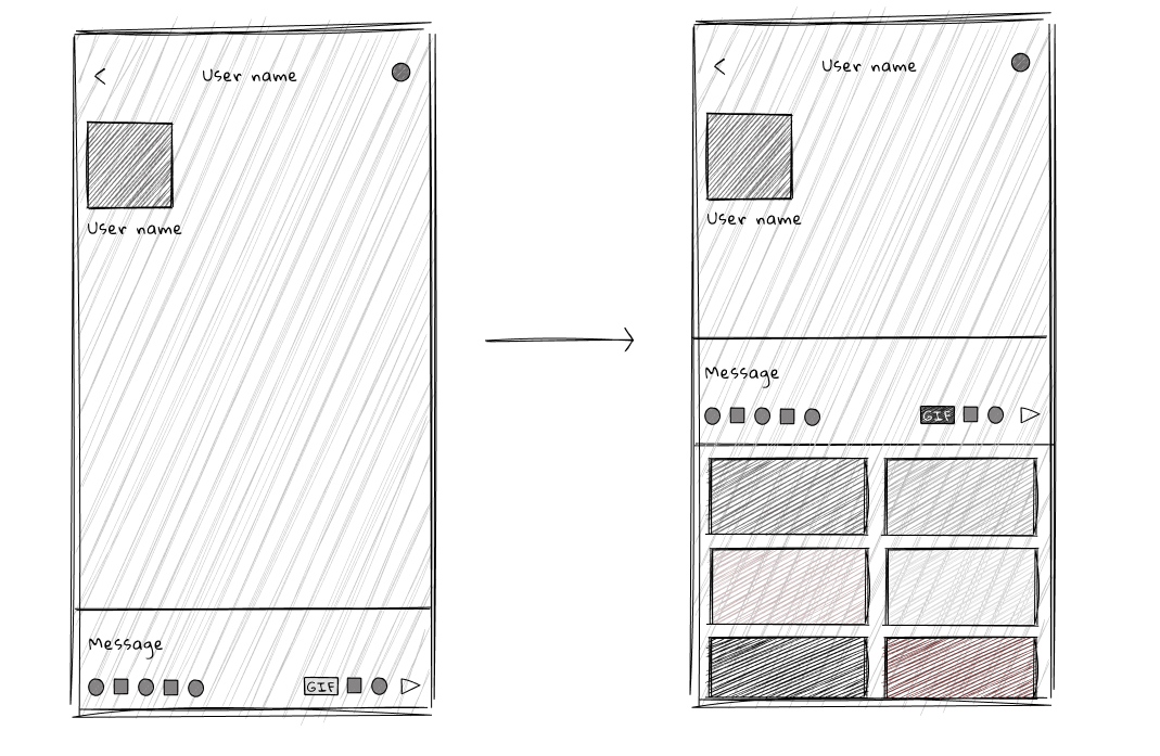 Mobile window sketches
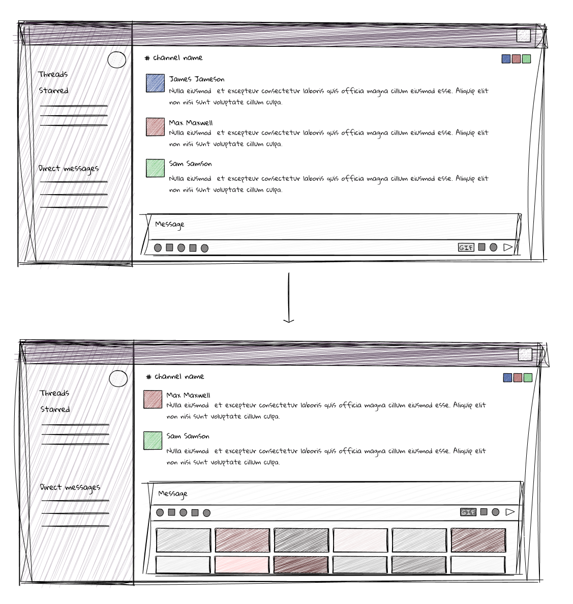
Figma Prototyping
Next, the Slack window has been created in Figma. The overlay technique has been used to ensure the right measurements and spacing of the components.
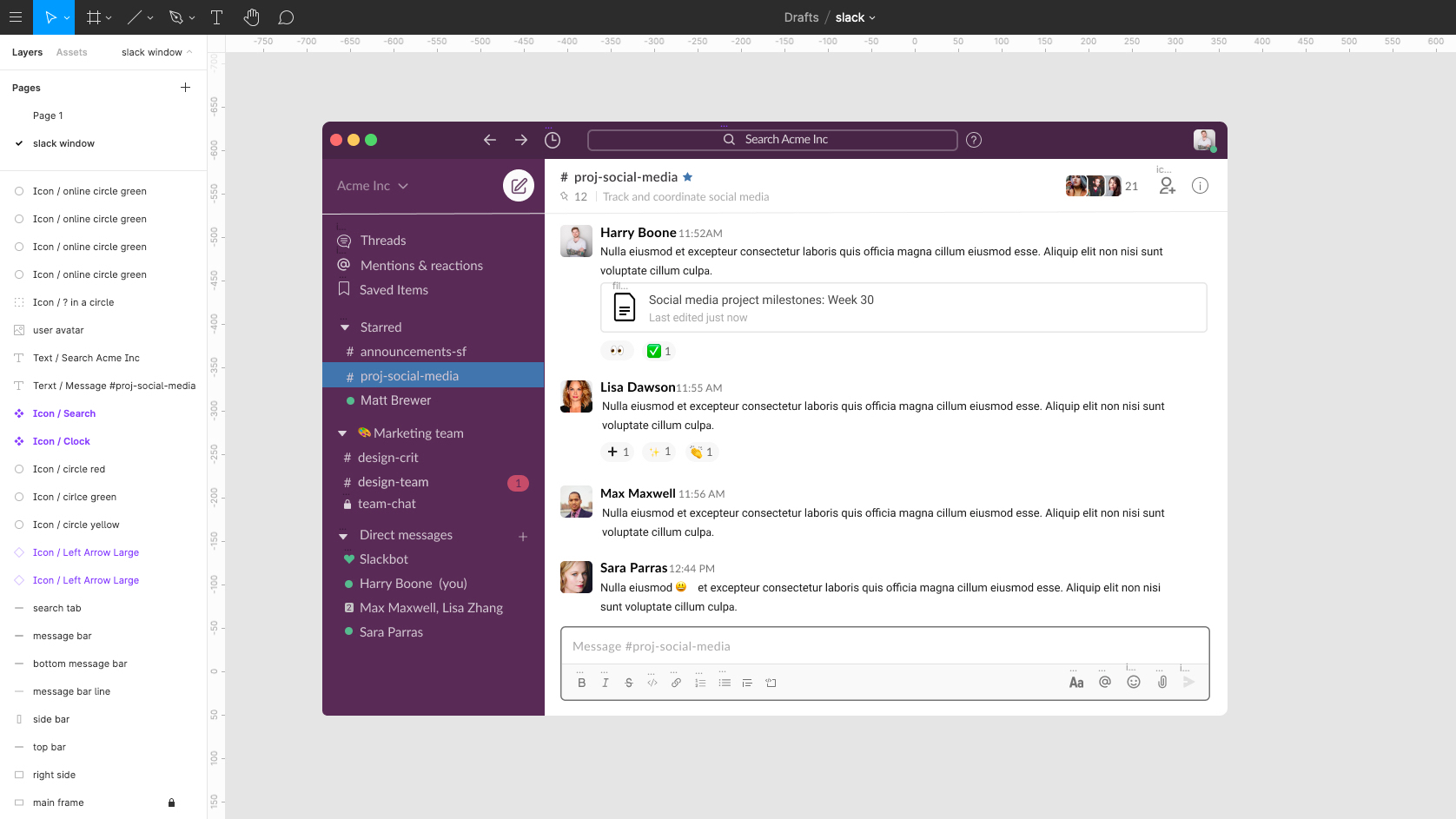 Slack window. Image used as a guide from: https://slack.com/intl/en-gb/help/articles/360043092173-The-Slack-experience-for-desktop
Gif button component has been created in the style matching other buttons on the message tab.
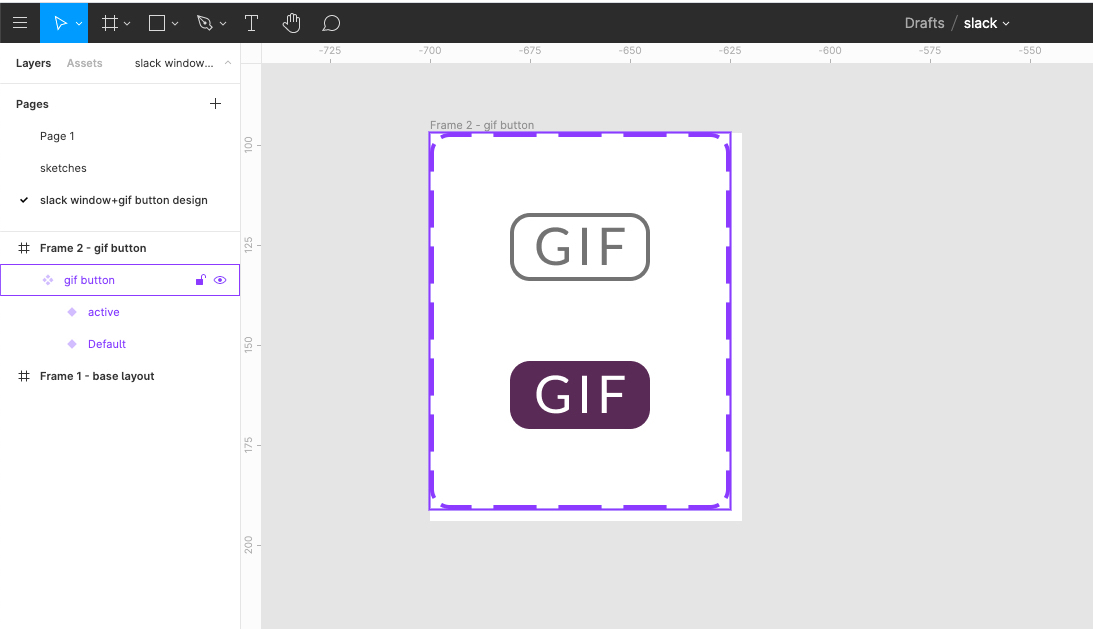 Gif button design
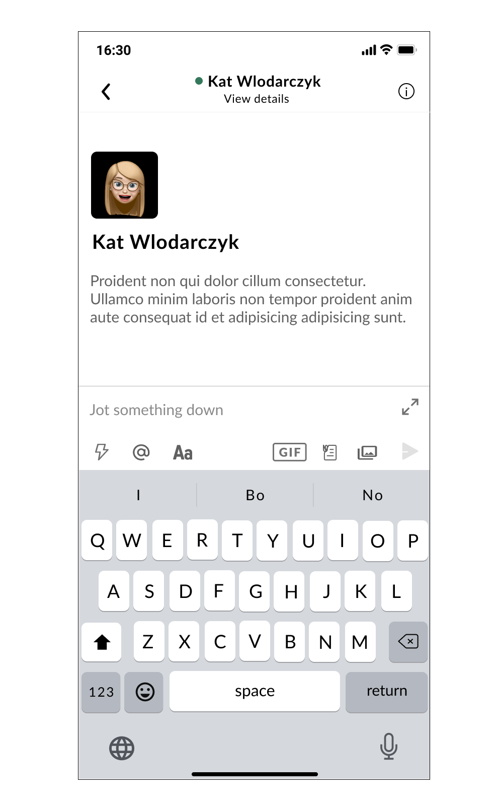
Gif button was then added onto a base layout, keeping in mind the spacing between the other elements.
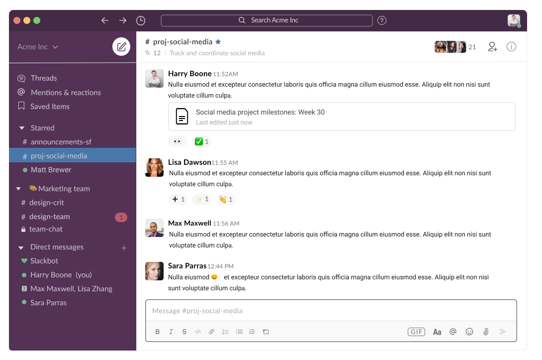 Base layout enhanced with a Gif button
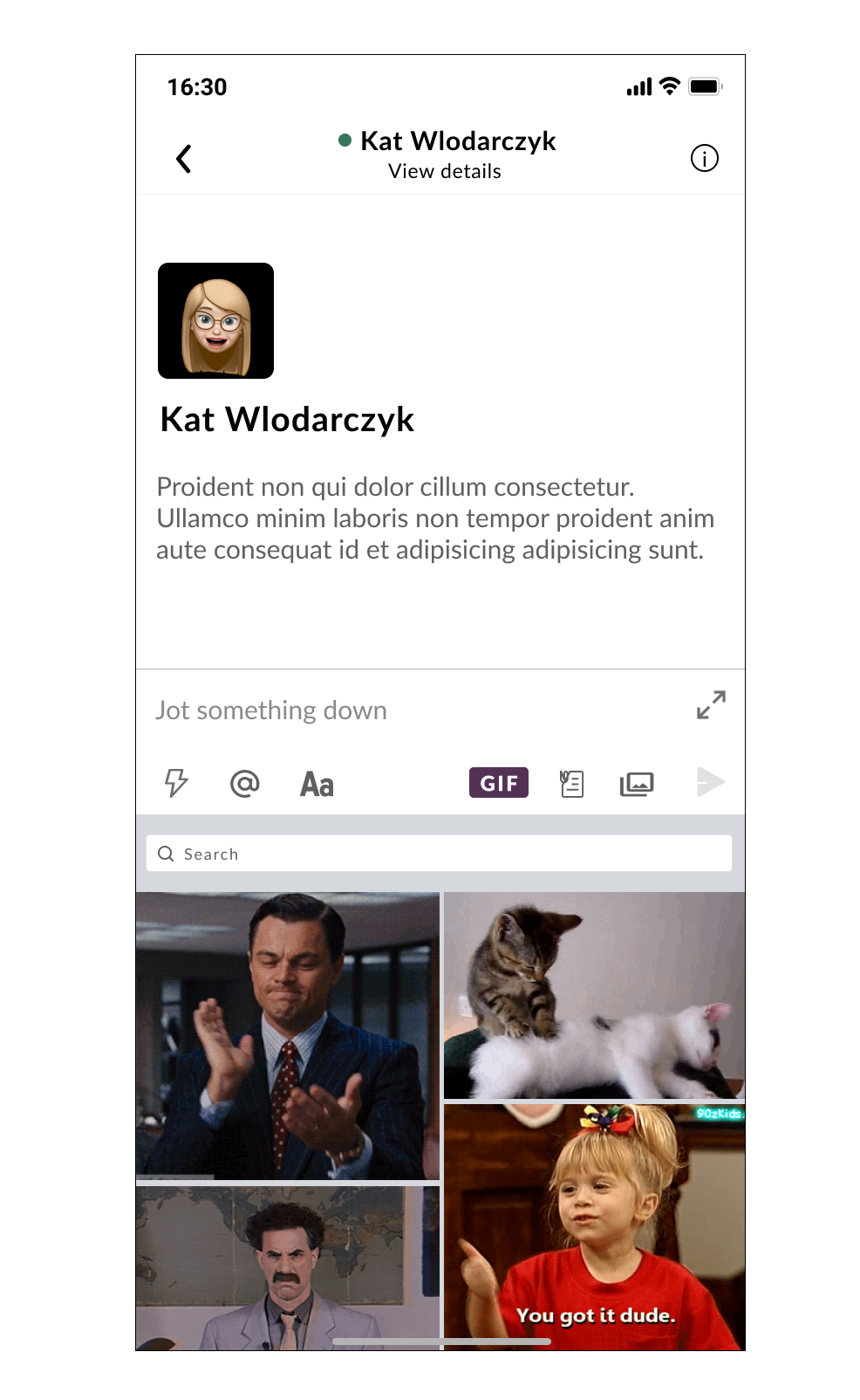
Lastly, the design of the open gif bar has been created for both desktop and mobile windows.
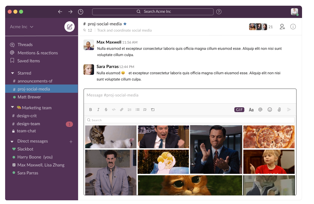 Base layout with an open Gif bar
 Base mobile layout
 Base mobile layout with open gif bar
Deliverables from this phase are desktop and mobile designs featuring a gif button. Click the link below to view the Figma file ⬇︎
Results
Completed designs have been enhanced with animated interactions to showcase the envisioned idea. Below, you can click on the Gif button to open up the gif bar or click on the link at the bottom to navigate to the Figma file.
Conclusions
The finished product is an enhancement of the current design, solving the problem of poor accessibility to gifs on Slack. User experience has been improved by introducing quick and easy access to gifs straight from the message tab.
Positive outcomes: → Users can now see and scroll through multiple gifs, even without typing a phrase to search for. → Functionality similar to those found in other messaging platforms means less time spent by a user figuring out how the new feature works. → The issue of losing the perfect gif or meme have been eliminated. → Time spent searching for a gif has been dramatically reduced.
Do you use Slack?
What do you think of my idea to enhance the current design and functionality of Slack with a Gif button? Let me know in the comments! 👇